Biology, illuminated
Axiom is an AI drug discovery platform from San Francisco. It predicts whether a compound is toxic before it ever reaches a patient.
We built its whole visual world around one direction, Biology Illuminated: zoom into a living cell, and find the brand already there.
Deliverables
Members and Partners involved
Alessandro
Byron
- Little Plains
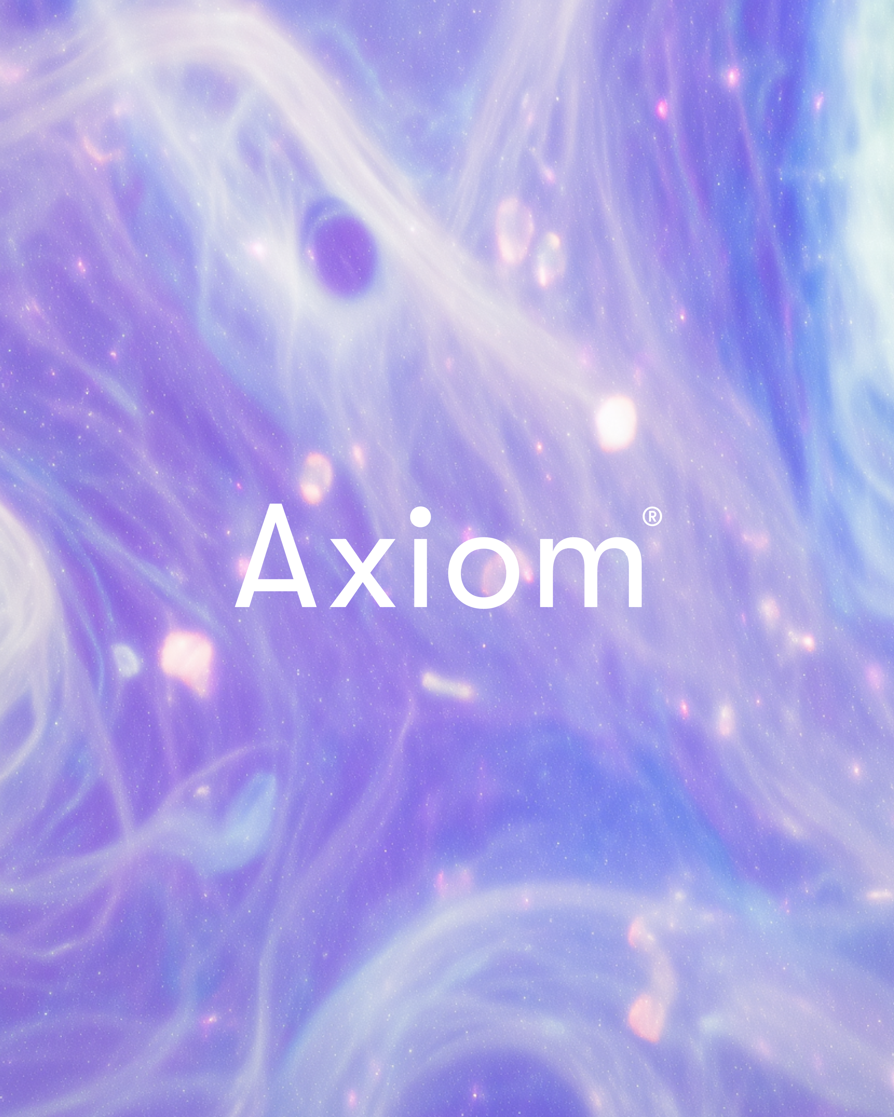
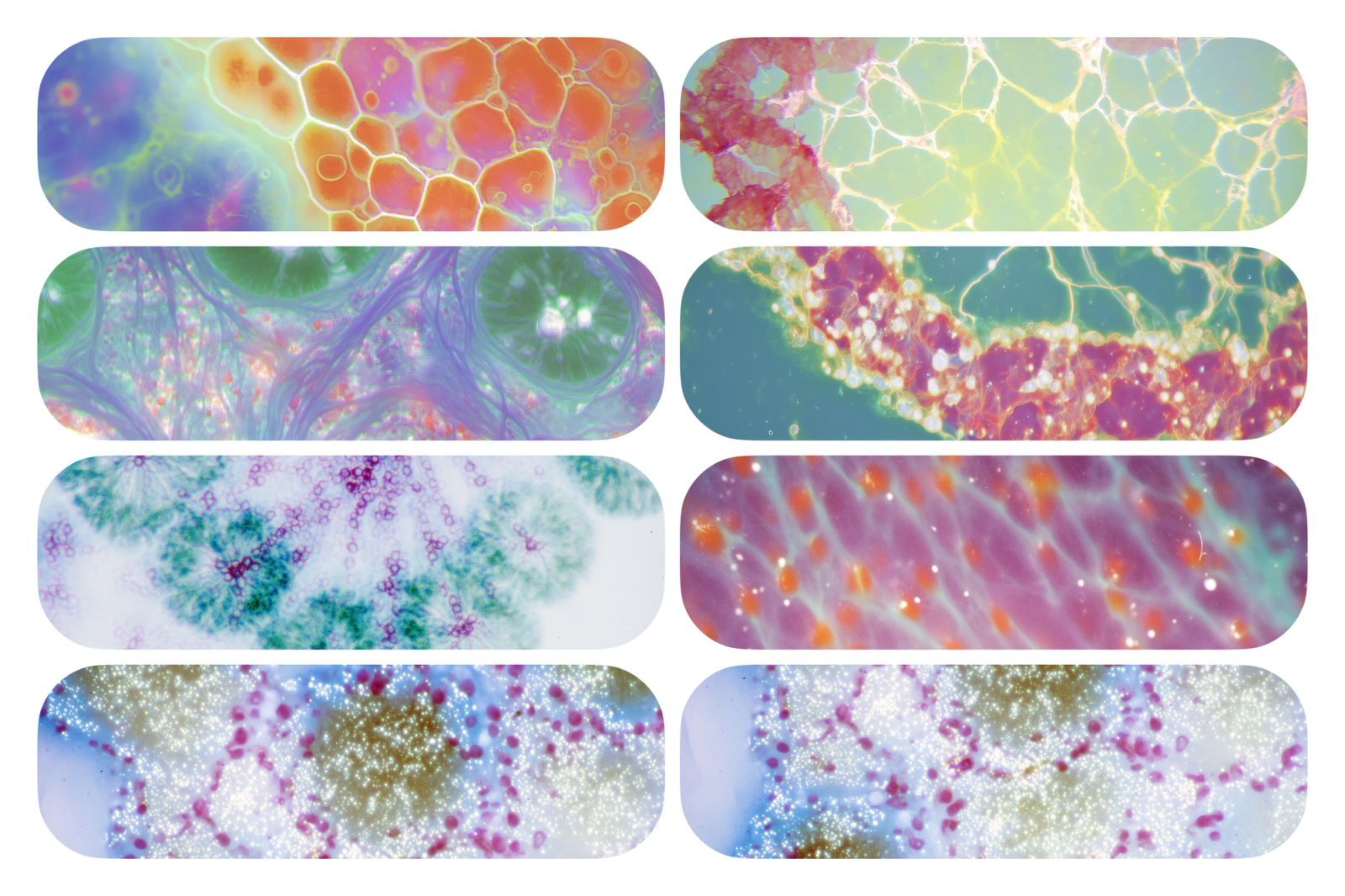
The direction came out of Axiom's own science. Their platform runs drugs through human cell cultures, and every experiment leaves behind real pictures of those cells. We took that output, the actual visual record of the research, and made it the ground the whole brand stands on.
Shot at macro scale and rendered with an iridescent sheen, the cellular photography starts to look like a night sky, a reminder that there is an entire cosmos already at work inside each of us.
One motif holds it all together, and that is the orb. Depending on where it appears it leans towards organic biology or towards precise technology, and it works as a logo variant, as the hero of the homepage and as the anchor on every other surface. It is made from the same cellular imagery as the rest of the brand, pressed into a single form that reads as scientific and alive at once.
For type we paired GT Walsheim, a clean geometric sans, with Atlas Typewriter, a monospace made for data. That gives Axiom two voices: a warm, clear one for a general audience, and an exact one that holds up inside dense research, where precision counts for more than personality.
The homepage opens on the orb and a four-word mission: “Ending unexpected drug toxicity.” Below it sit one positioning line and two ways into the platform. The audience is pharmaceutical researchers who are wary of AI and used to crowded, clinical interfaces, so the page had to explain Axiom within seconds of landing.
The science pages carry the real weight. One visualization maps the drug discovery pipeline from target identification to clinical trial, and shows exactly where Axiom's AI steps in. Another plots human exposure against predicted risk, with clinical prediction, toxic exposure and therapeutic exposure kept clearly apart. A scientist judging the platform and an investor judging the company both read these pages, and neither could be handed a flattened version of the data.
At the heart of the product sits a reasoning agent. A scientist asks a question, and the platform builds a safety assessment by comparing compounds across bioactivity, necrosis and viability. The answer comes back as something close to an article, with the data visualized inline, so every step of the AI's reasoning stays open to checking. We wanted it to feel as considered as the brand around it.
Most of a scientist's day happens in the data exploration layer. Fluorescence microscopy from the cell culture experiments is grouped by toxicity mechanism, and each view is labeled with its stain and biological marker. The job was to let people compare dense, specialized imagery quickly, without degrading the source material.
Underneath it all we designed a complete atomic component library in Figma, handed off ready for development: buttons, controls, dividers, dropdowns, navigation, search, tables and patterns, each with every variant of size, state and color. It is desktop first, built for people who spend their working day inside dense data.
Creative Ops for brands
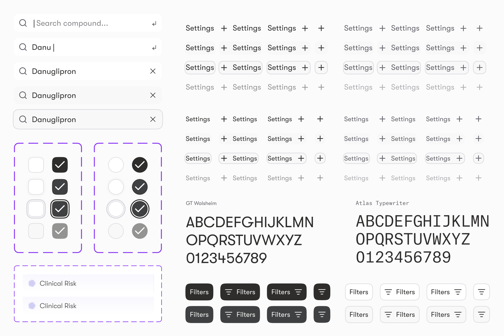
A persistent sidebar handles browsing by collection, and a top bar handles search and filtering. The exploration tables show compound-level metrics across clinical risk categories, with enough in every row for a researcher to make a first call without clicking through. Each component was made to take Axiom's density of data without losing its looks.
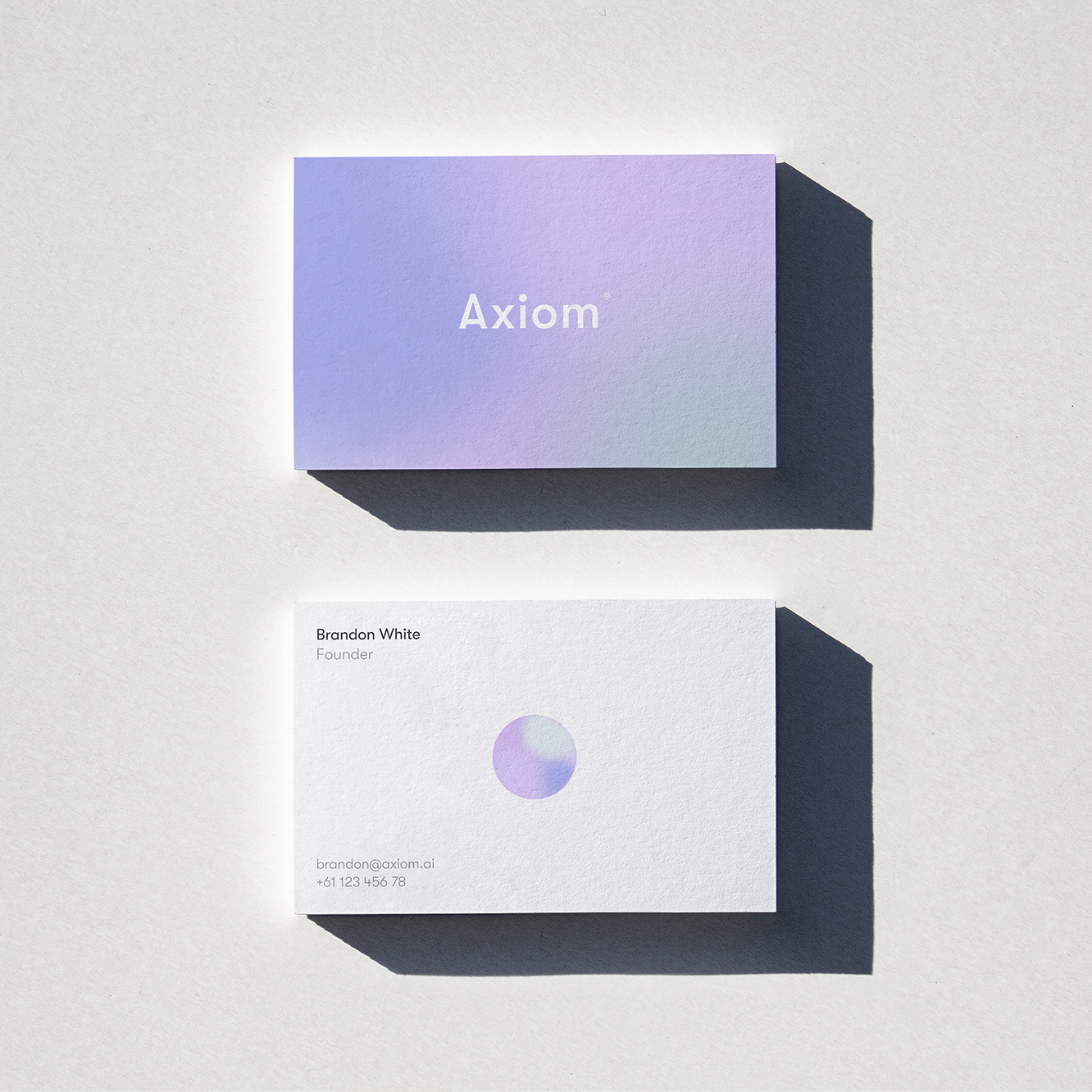
The full system covers typography, color, gradients, components, logo variants, mockups, generated imagery and social templates. All of it traces back to the same cellular source, so it holds together on a conference screen, in a social post or inside the product. The brand and the product share the same DNA.
The presentation system takes the brand into pitches, board meetings and conference talks. Slides move between full-bleed cellular imagery, clean data layouts and product screenshots, and the orb and its gradients tie each one back to the identity. Anyone on the team can build a deck that looks like Axiom without asking a designer for every slide.
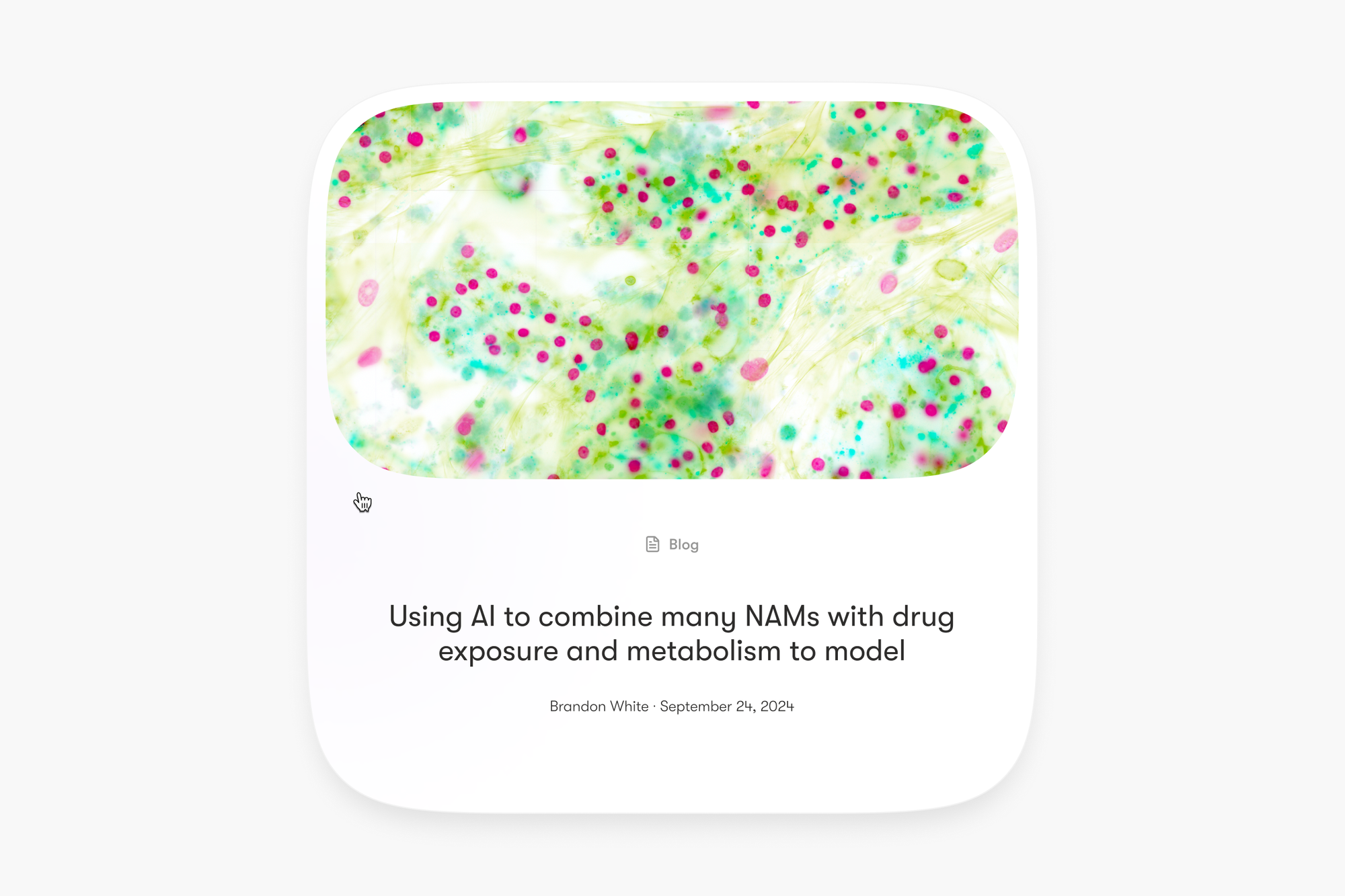
On the site, the publications section keeps scientific papers apart from the blog, each with its own layout. Every post opens on full-bleed cellular imagery that doubles as its thumbnail in the index. It all runs on Sanity, so Axiom's team publishes on their own and the visual language holds no matter who writes, or what about.
The brand also steps off the screen. Booths, screen graphics and presentation material at conferences all draw from the same library of cellular imagery, so meeting Axiom at an industry event feels like a continuation of the digital experience rather than a separate project.
The work spanned brand strategy, positioning, identity, generative imagery, product UI with its full component system, copywriting, site design and development, presentation design and conference material. Thanks to Brandon and the Axiom team for trusting us with all of it.