Backing what comes next
New brand launch for the NYC fund specialized in decentralized systems. The design is based on the idea of an encrypted binary alphabet that functions as a brand system: logo, typography, graphic elements and motion motifs. Every part of the brand now speaks tech knowledge without flaunting it, in pure iykyk aesthetics.
Deliverables
Members and Partners involved
Tom
Alessandro
- Little Plains
CoinFund started investing in crypto in 2015, a month before Ethereum shipped, and by the time they came to us a decade later the brand had stopped keeping up with the firm it belonged to. What they needed was one system that could carry the weight of a New York investment house and the fluency of the people they fund, at the same time and in the same marks.
We built everything on a single idea, which is CoinFund's name written in binary. Ones and zeros are the base language of computation and cryptography, so the motif belongs to this firm by right, coming out of the work they do every day and out of the things they put money into.
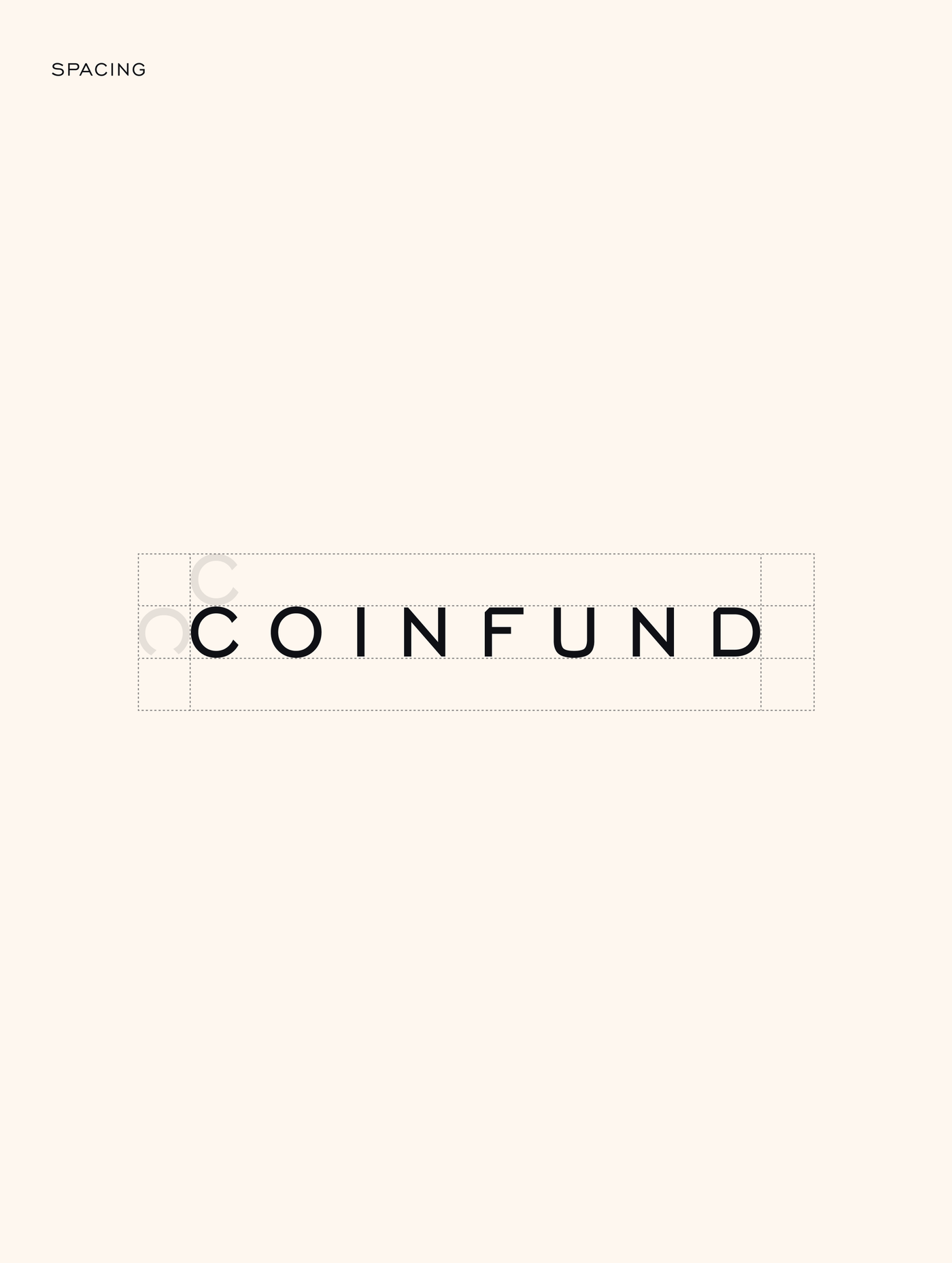
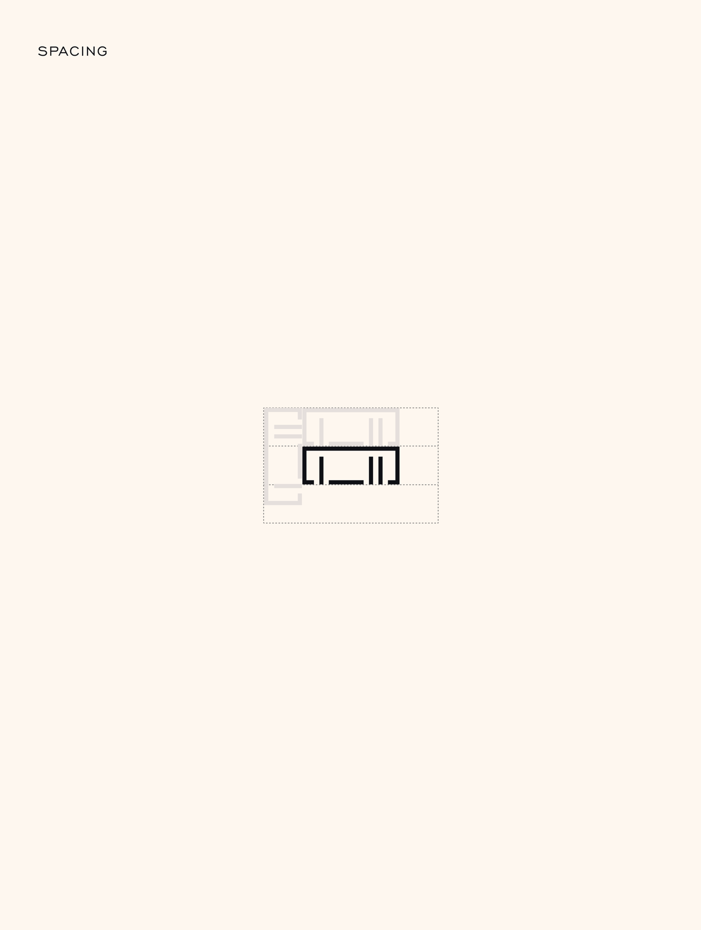
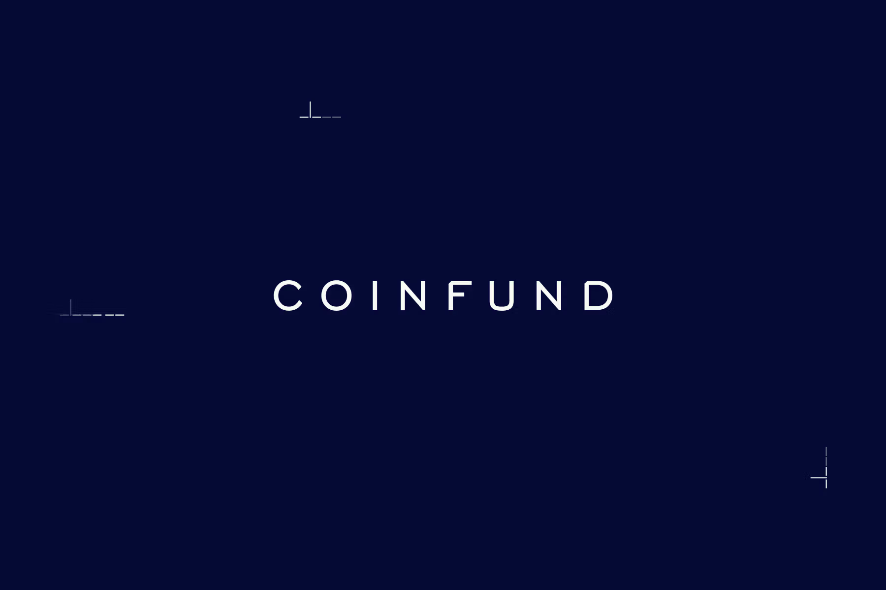
For the wordmark we took Engravers Gothic, softened its edges and opened the space between the letters, partly because the face already carries an etched, certificate quality that does the institutional work for us, and partly because the binary strip needed room to sit underneath without the two of them crowding the same line.
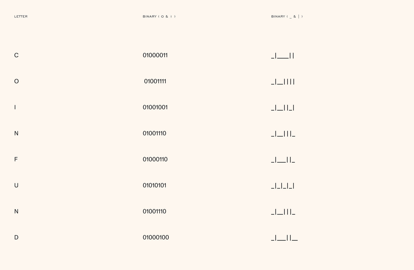
Every letter has a binary equivalent, so what we handed over is a working alphabet that can be set in almost anything: a name, a headline, an invitation, or the initials of whoever happens to be on the team page that month.
In motion the letters dissolve into binary and come back to type, and we never explain it anywhere on screen, since the whole point is that the name and the code are the same thing, and watching it happen once is enough for most people to get it.
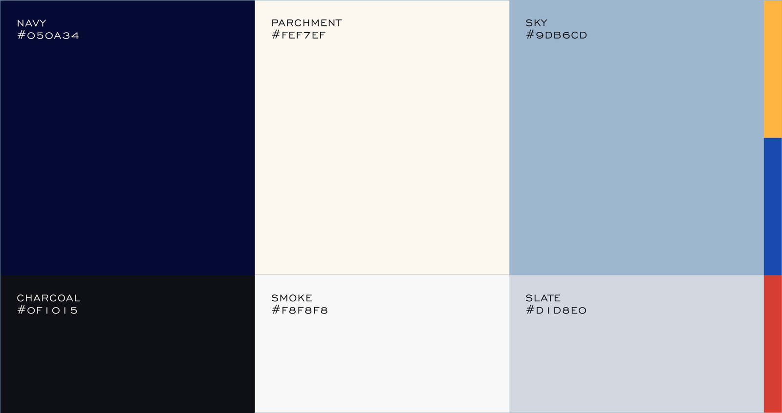
Deep navy and charcoal carry the institutional side of the firm, while parchment, sky and slate keep the system breathing, and the accents (amber, cobalt, vermilion) sit low enough in the hierarchy that we can save them for the few moments that genuinely need to land.
Creative Ops for brands
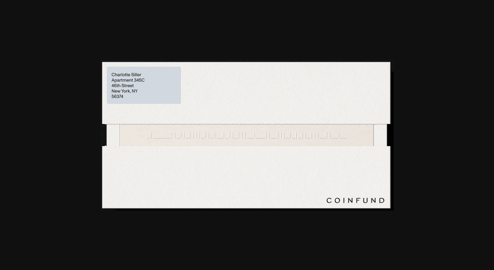
On paper we emboss the binary strip, which at that size stops reading as data and turns into texture, so the people who bother to decode it get something back, while everyone else simply registers a piece of stationery that somebody cared about.
The site runs on the same system, with a navy gradient, the binary mark anchoring the navigation, and an encoder that takes whatever a visitor types and hands it back in CoinFund's alphabet, which we have all used to write our own names more times than any of us will admit.
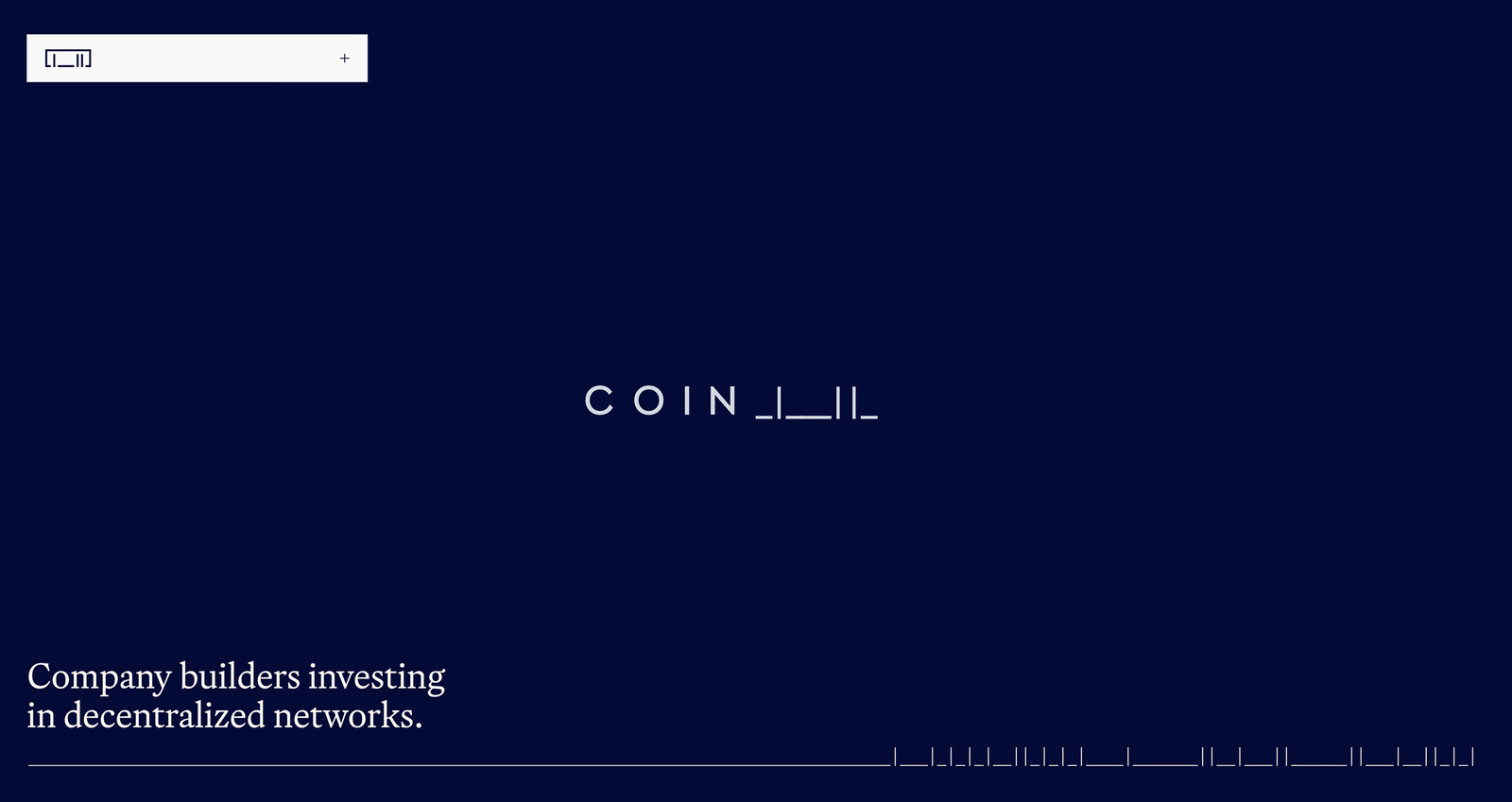
Most of the care went into the parts nobody is obliged to notice, like the team page where hovering over a person brings up their initials encoded, or the article cards that pair photography with the category tags, and the binary and the alphabet keep trading places the whole way down the page.
The portfolio carries a decade of investments and needed more structure than anything else we built, so it has filtering by sector and stage, a table for the people who want the facts quickly, and a timeline for anyone who wants to see the shape those ten years actually made.
What we ended up with is a brand that knows exactly what it is talking about and stays quiet about it, built once as a system so that it holds the same way across motion, print, website and socials, which is usually the part that decides whether an identity survives its first year.