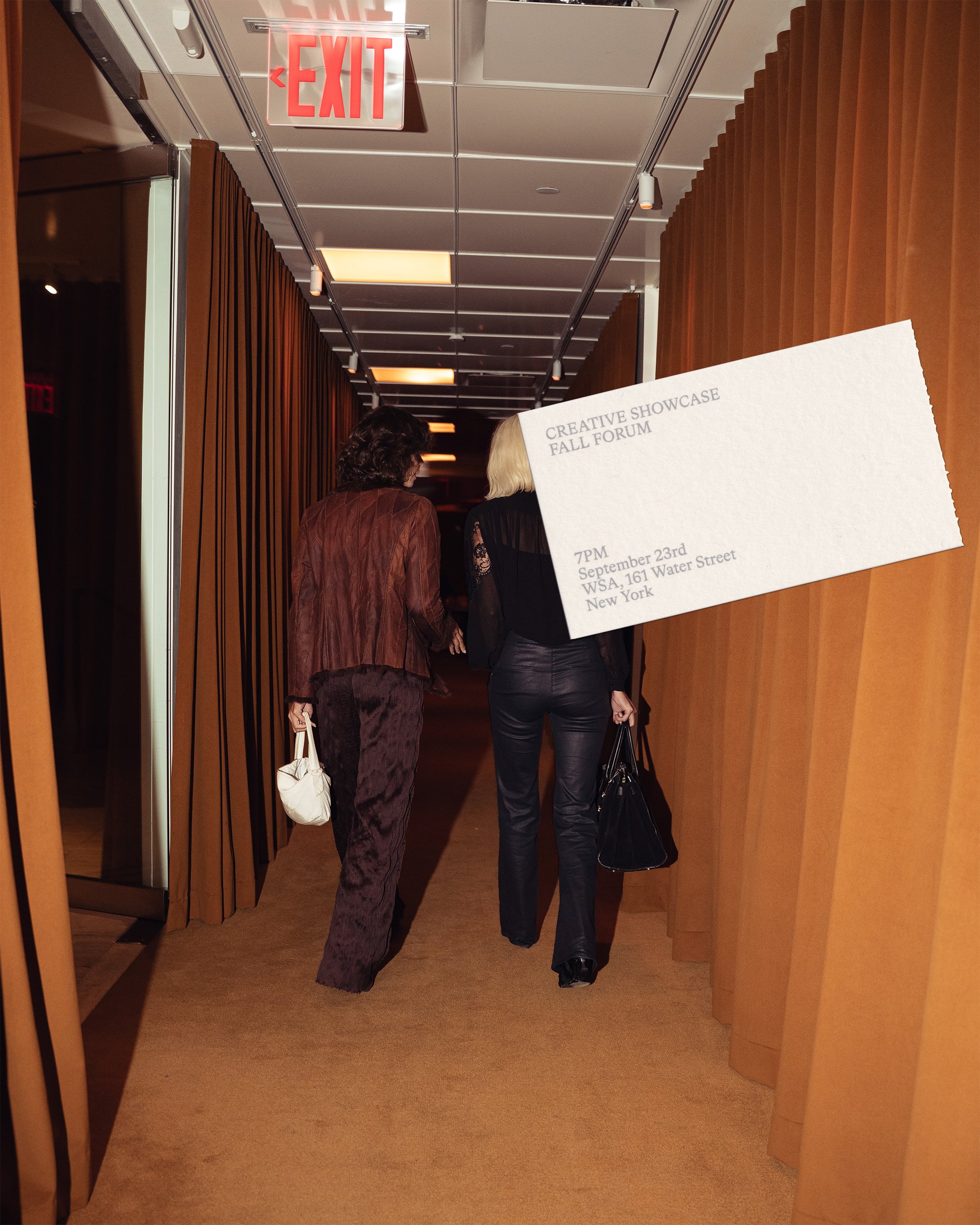
At this year’s fall showcase at WSA in New York, we gave a preview of our whole brand world evolution. Both Tom Mussak and I (
Alessandro) shared the conceptual foundations of NeueHaus, our work philosophy and many of the ideas that shaped our community in the past year.
One of the anecdotes that we shared is about Mr Wolfe, the famous Pulp Fiction character who in my eyes has always been the embodiment of a freelancer: someone particularly good or effective at what they do that companies and individuals call to solve a specific problem.
Dressing the Haus
How the NeueHaus identity came to life from our early work and inspiration to the influences of working closely with our members.
Part visual showcase, part narration of what NeueHaus stands for, this article presents our work philosophies and ideas of how to run a creative professional network.
Deliverables
Members and Partners involved
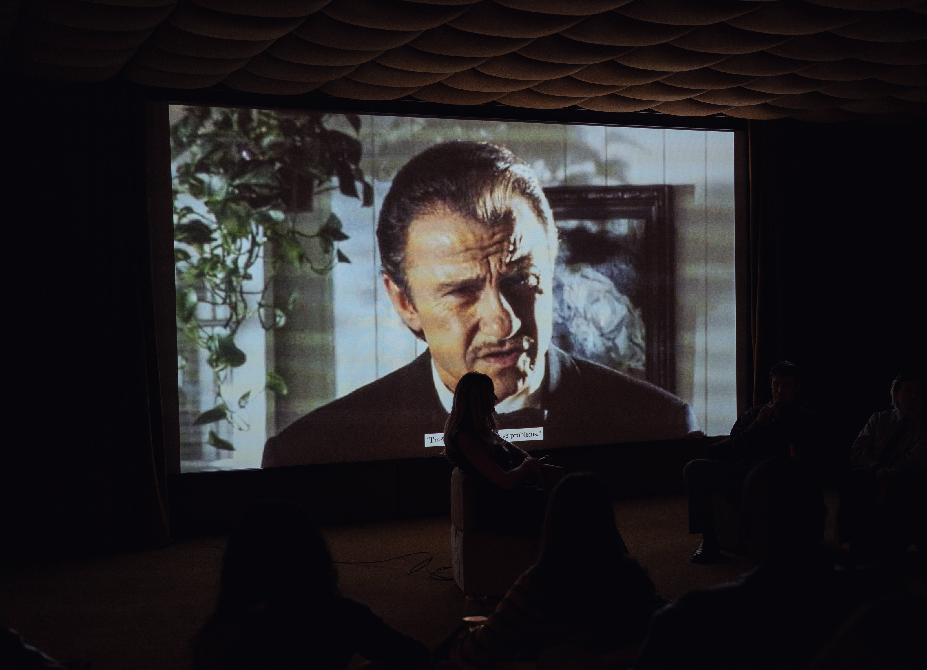
He shows up at Tarantino’s house introducing himself with the catchy “I’m Mr Wolfe, I solve problems”, and in 20min he has the gangsters clean up the mess they found themselves in and moves on. Quick, professional and effective.
Now, whether you work for a company, an agency or independent, you most probably encountered at least once someone like him. We call them The Externals. Sometimes they are a whole team or agency, and sometimes they are loosely organized, independent freelancers who are exceptionally good at what they do. They come in, they solve the problem, and they move on.
Those are the people we built NeueHaus for, a curated network where the externals can find opportunities, advice, community and a specific point of view on culture and creativity.
Naturally, my interest in the origins of independent workers didn’t stop at Mr Wolfe. Digging into our respective Italian and German roots, Lena Piaand I studied how BauHaus and the guilds of Florence created platforms for independent talents to thrive and became an influential point of reference for the following centuries. Conceptually and overall visually, there was a lot to make sense of.
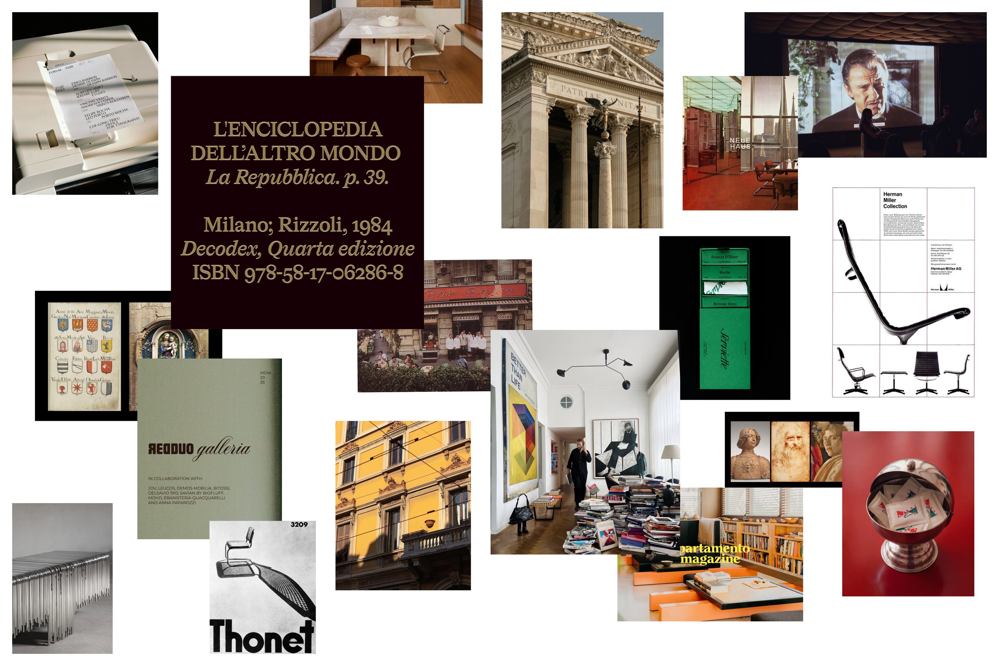
It’s while doing this research that we started falling in love with the ideas and symbols of the guilds. Among the most prolific ones we had the guild of Medici and Speziali (or physicians and apothecaries), in which the famous workshop of Andrea Verrocchio flourished and paved the way for talents like Sandro Botticelli and Leonardo da Vinci to rise up.
Besides the debatable cartel-like business administration, the guilds consistently promoted values that later Walter Gropius would use as the foundation of Bauhaus:
- Cross-disciplinarity at the core
- Fostering healthy competitions among members, with commissions and prizes
- Creating the infrastructure that allowed networking with other guilds, the church and the noble families
- Allowing workshops to pursue their individual brands and products
A few hundred years later, Gropius picked up these same concepts and created one of the most influential modern guilds ever—Bauhaus. Now as a designer, drawing inspiration from Bauhaus is like drawing inspiration from Italian cuisine as a chef—there are a lot of nuances at the very least.
But for us, the influence of Bauhaus has less to do with design and more with how we think about business, our brand, and how we enable our members to build their own identities within NeueHaus, using the network as a platform. That’s what we call a platform identity.
The platform identity
We love branding things, but NeueHaus is not a business that needs to maximize product sales. Our identity is meant to enable members to create more with it: initiatives, studio practices, brands and other products. In this light our brand functions as a catalyst of creativity, a platform that helps people launch their projects faster, and better.
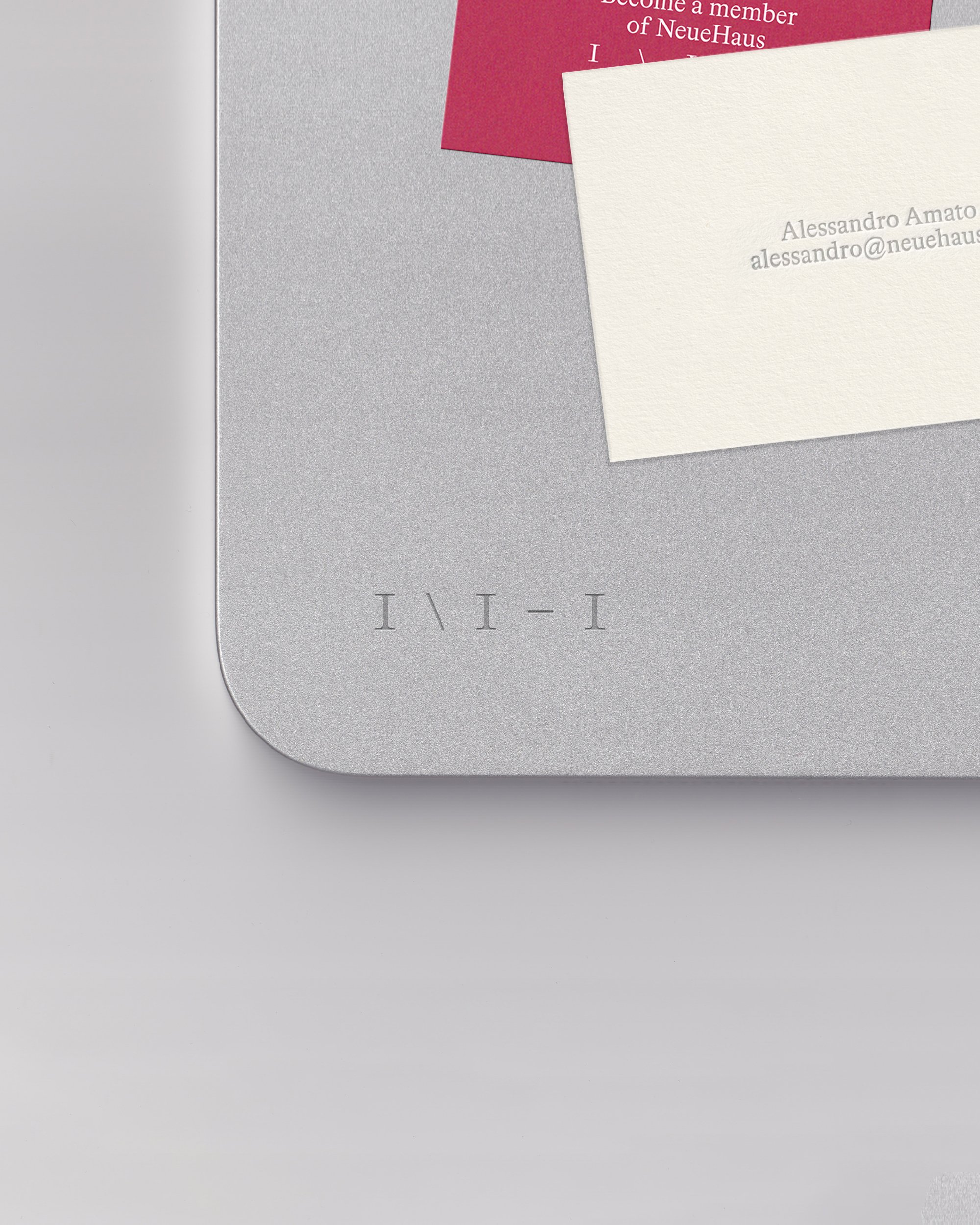
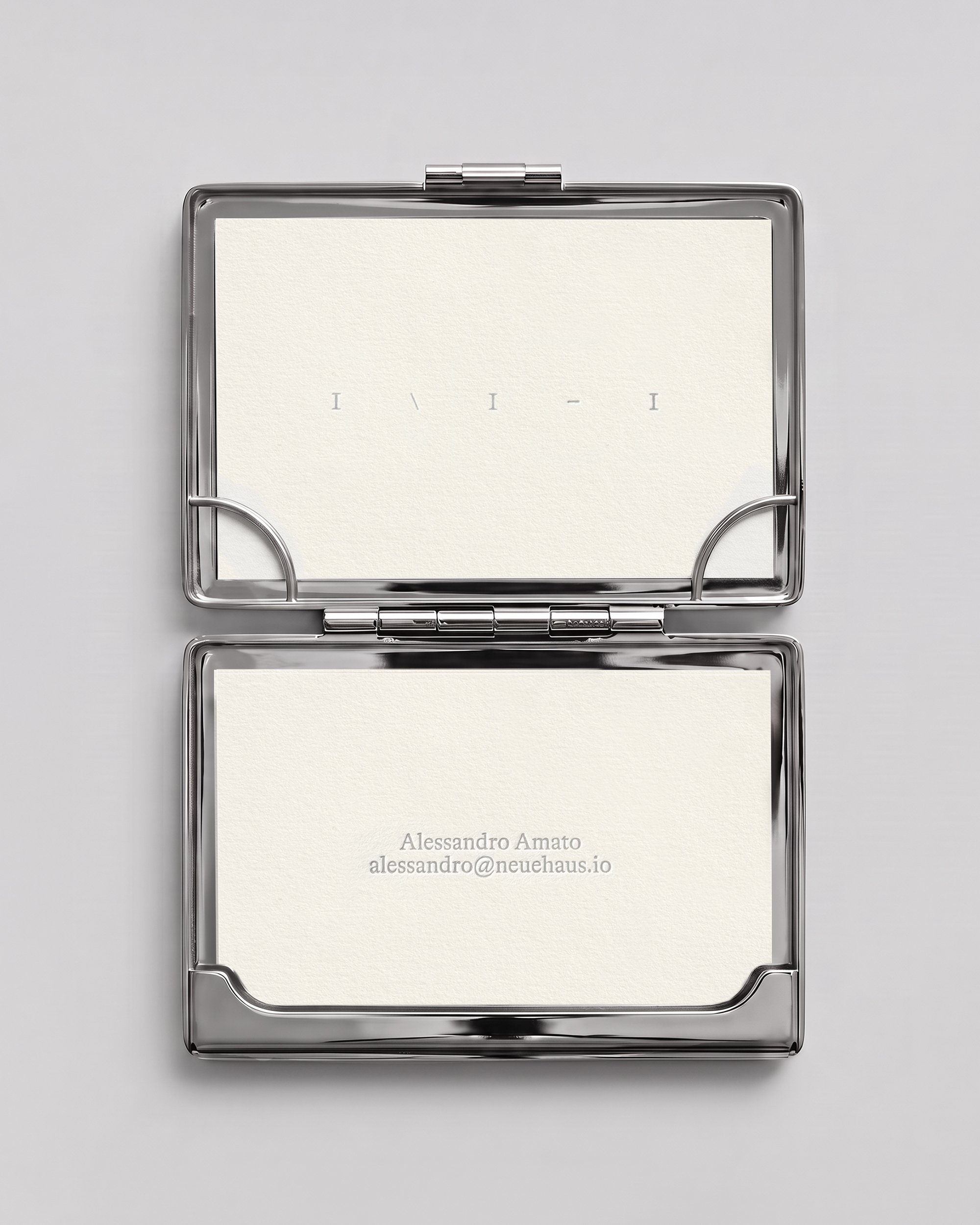
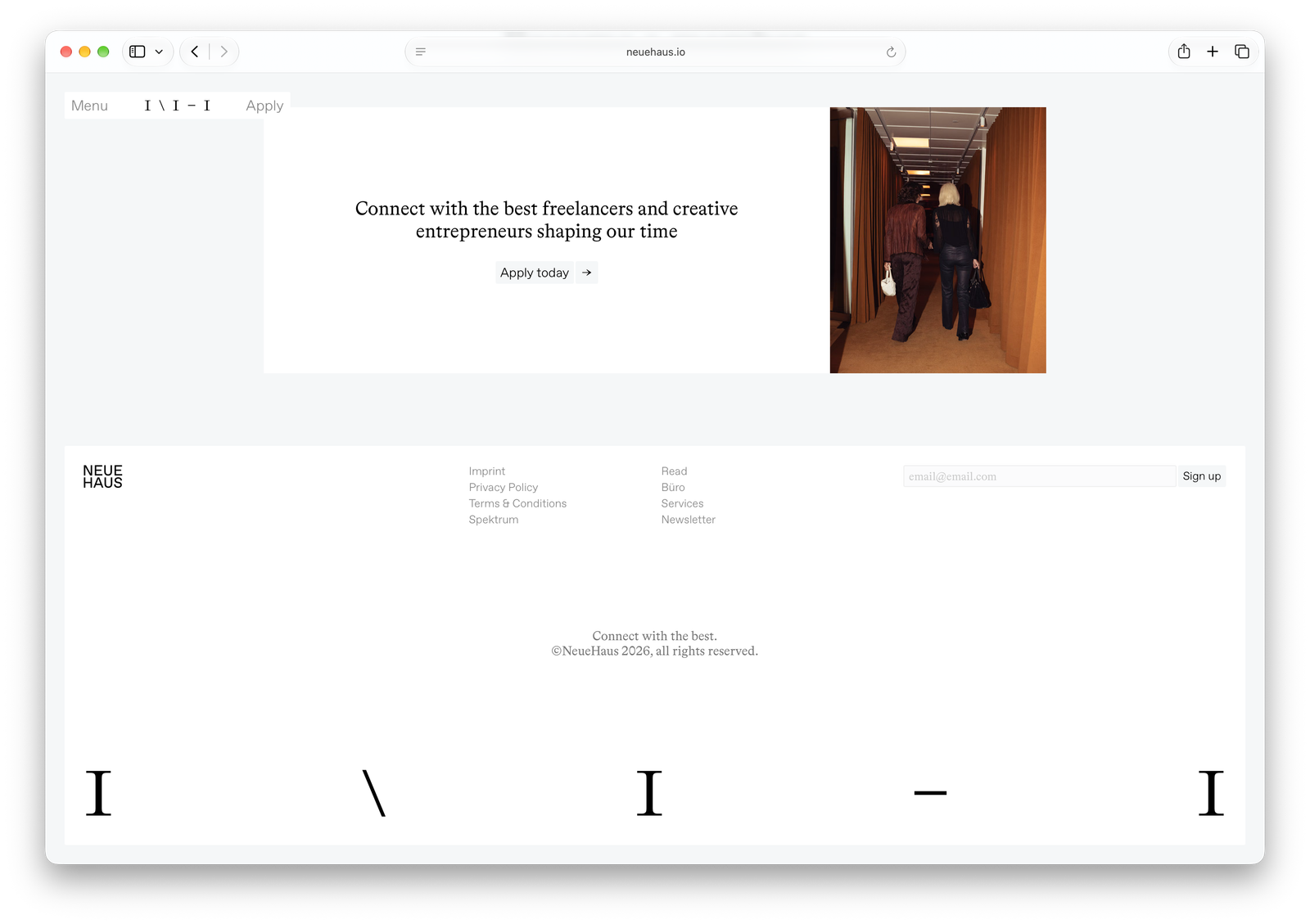
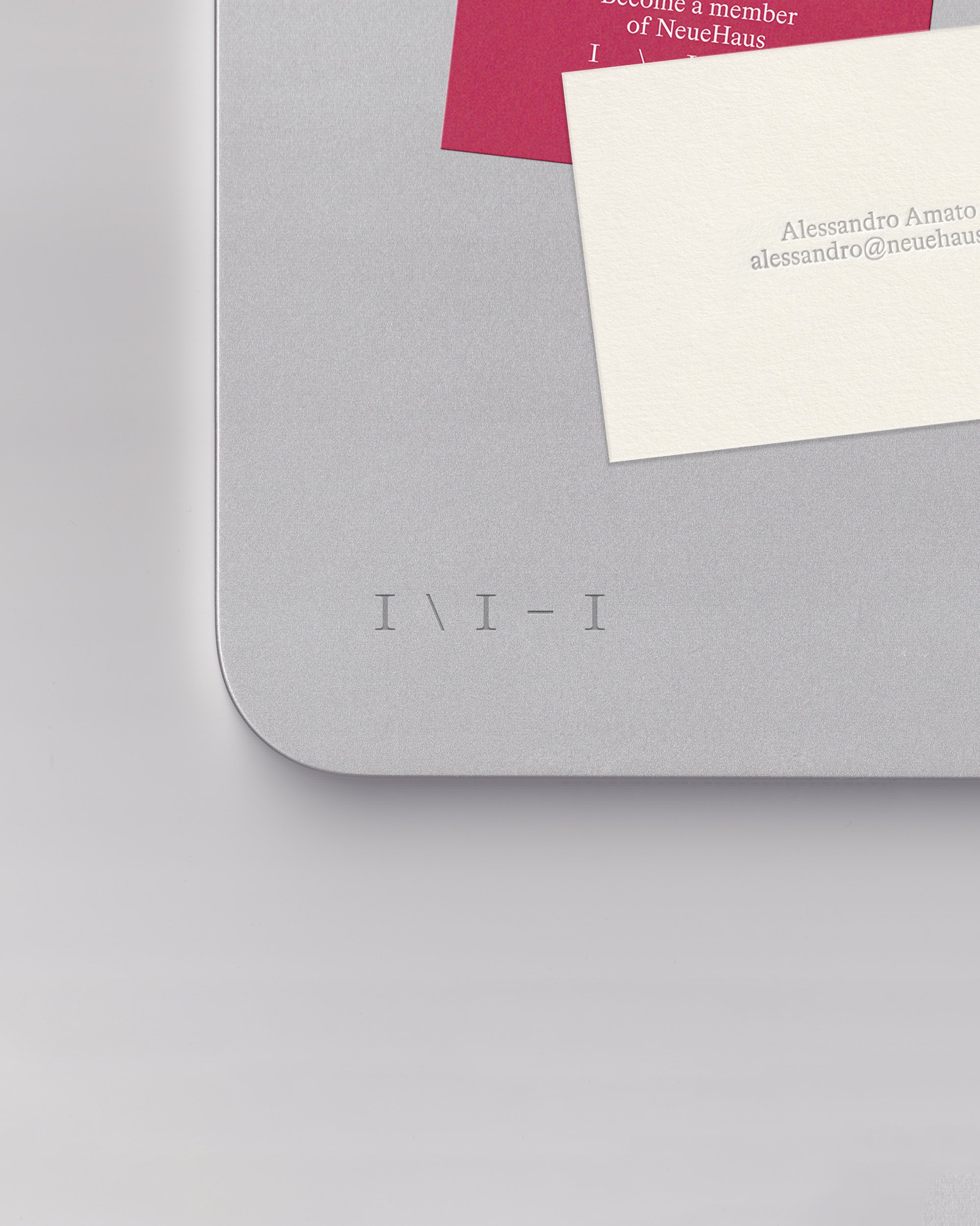
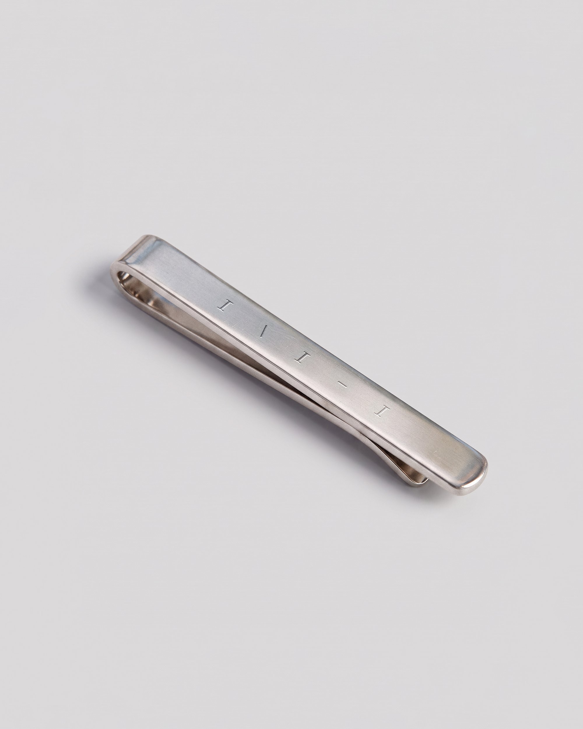
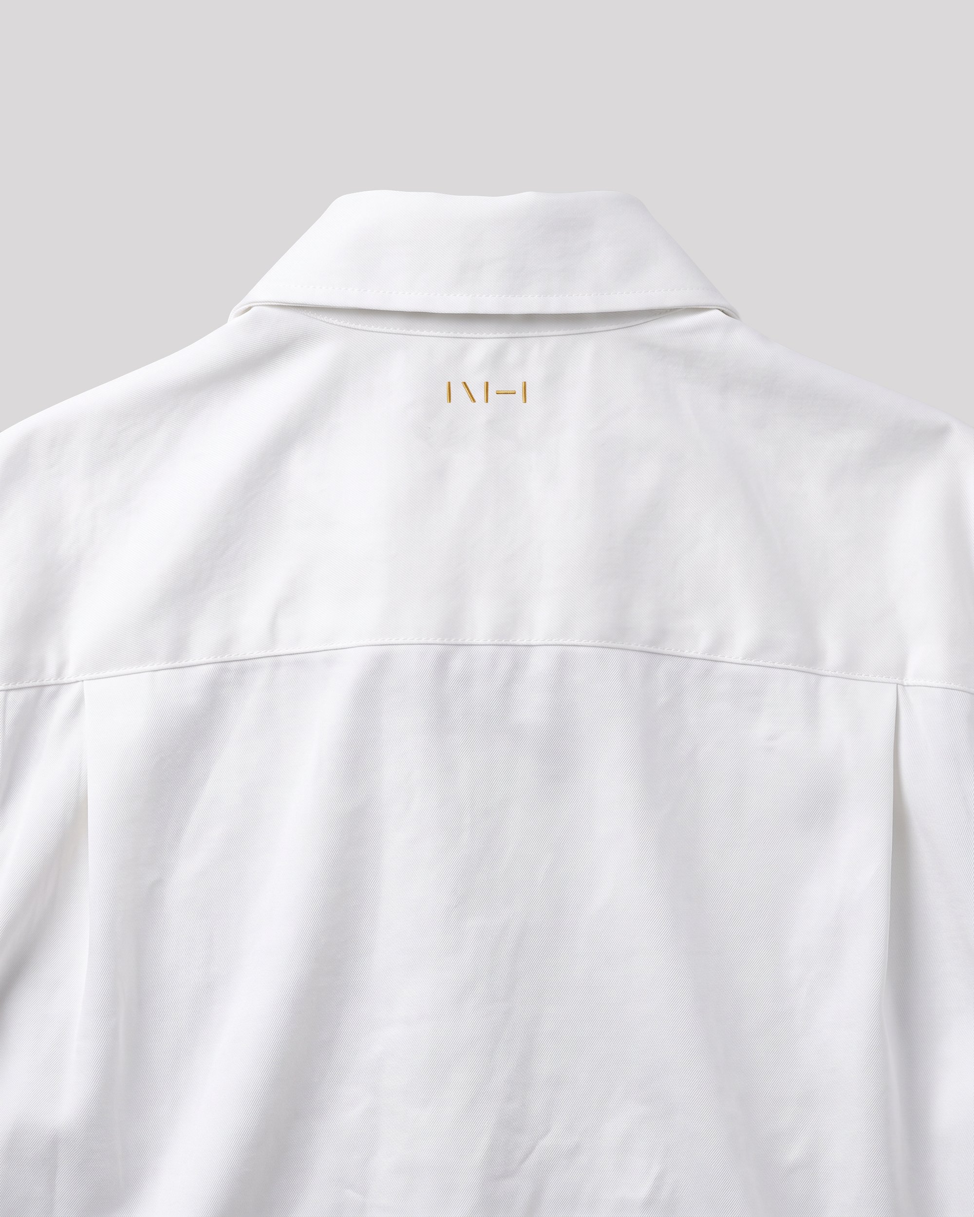
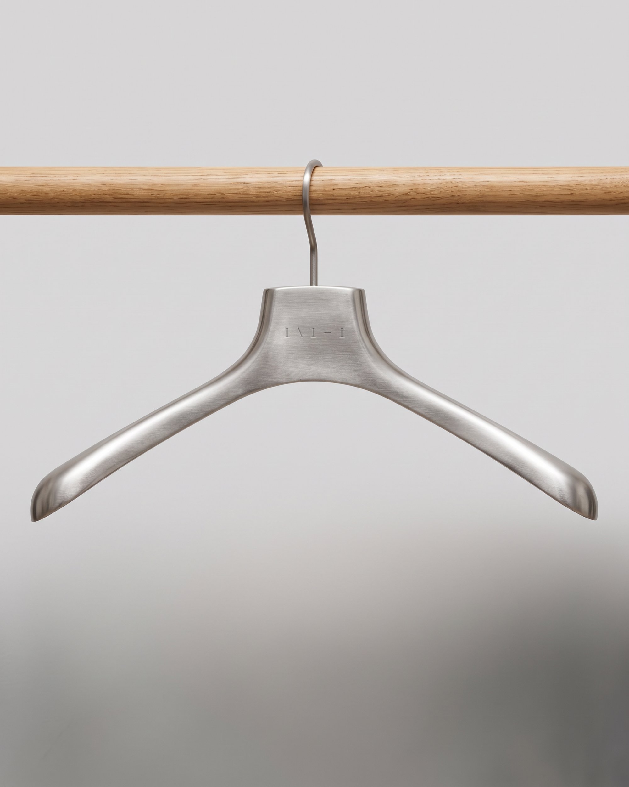
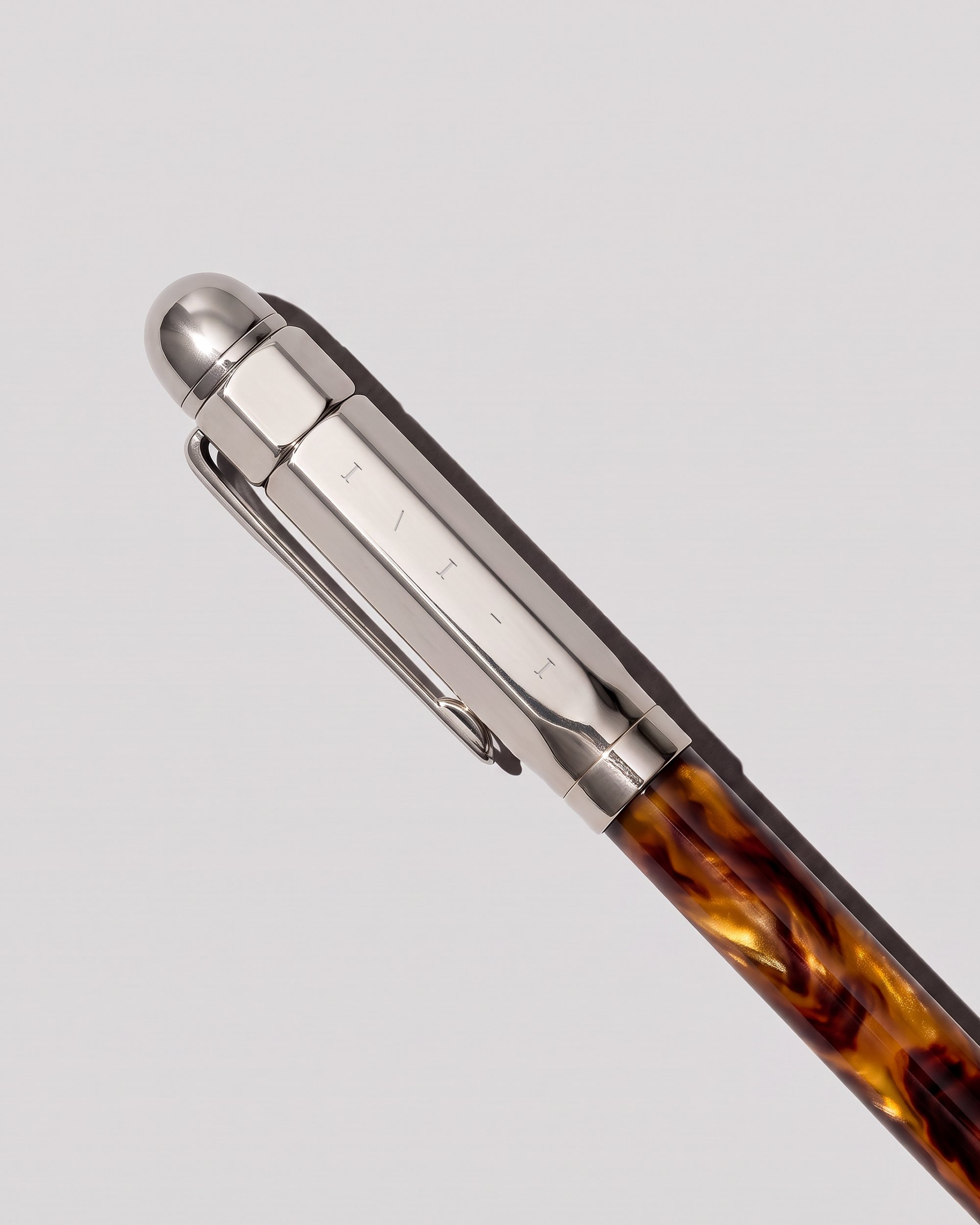
Our mark therefore is not exactly a logo, but more of a code, a symbol that signifies belonging. We use it in whatever way we see fit, in comments, email signatures, messages and as a mark on our creative work.
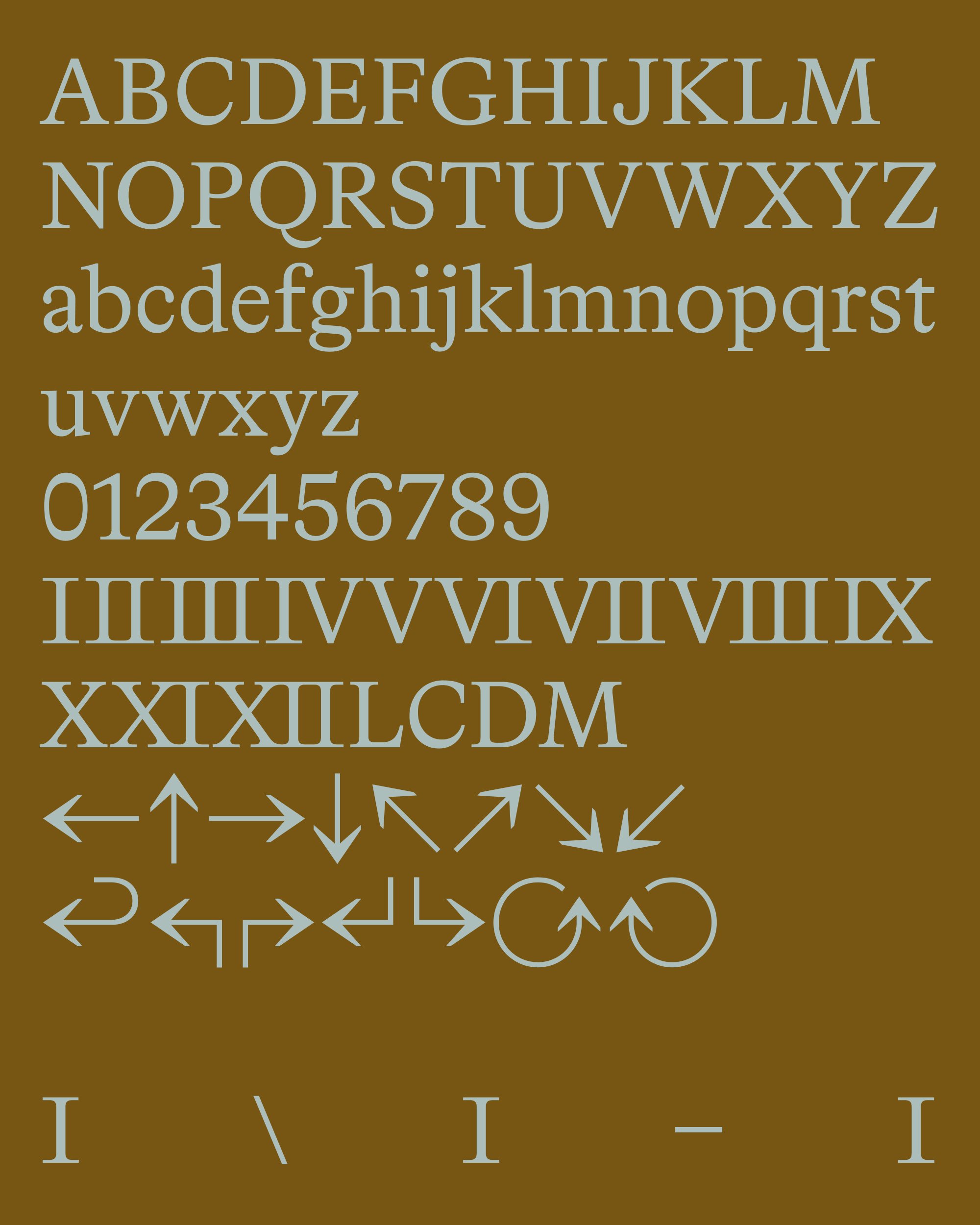
Focusing on these characters made us reflect on the importance of typefaces in an identity, especially when agents are picking fonts and doing brand research on our behalf. Our typeface had to be opinionated, intentional. Not because we don’t believe in AI and its potential for creative work, but because we think of it as a tool that operates on human ideas and systems, at least so far. Picking a typeface is a pillar of a respectable brand system that conveys meaning and elicits complex emotional responses, and hence cannot be outsourced.
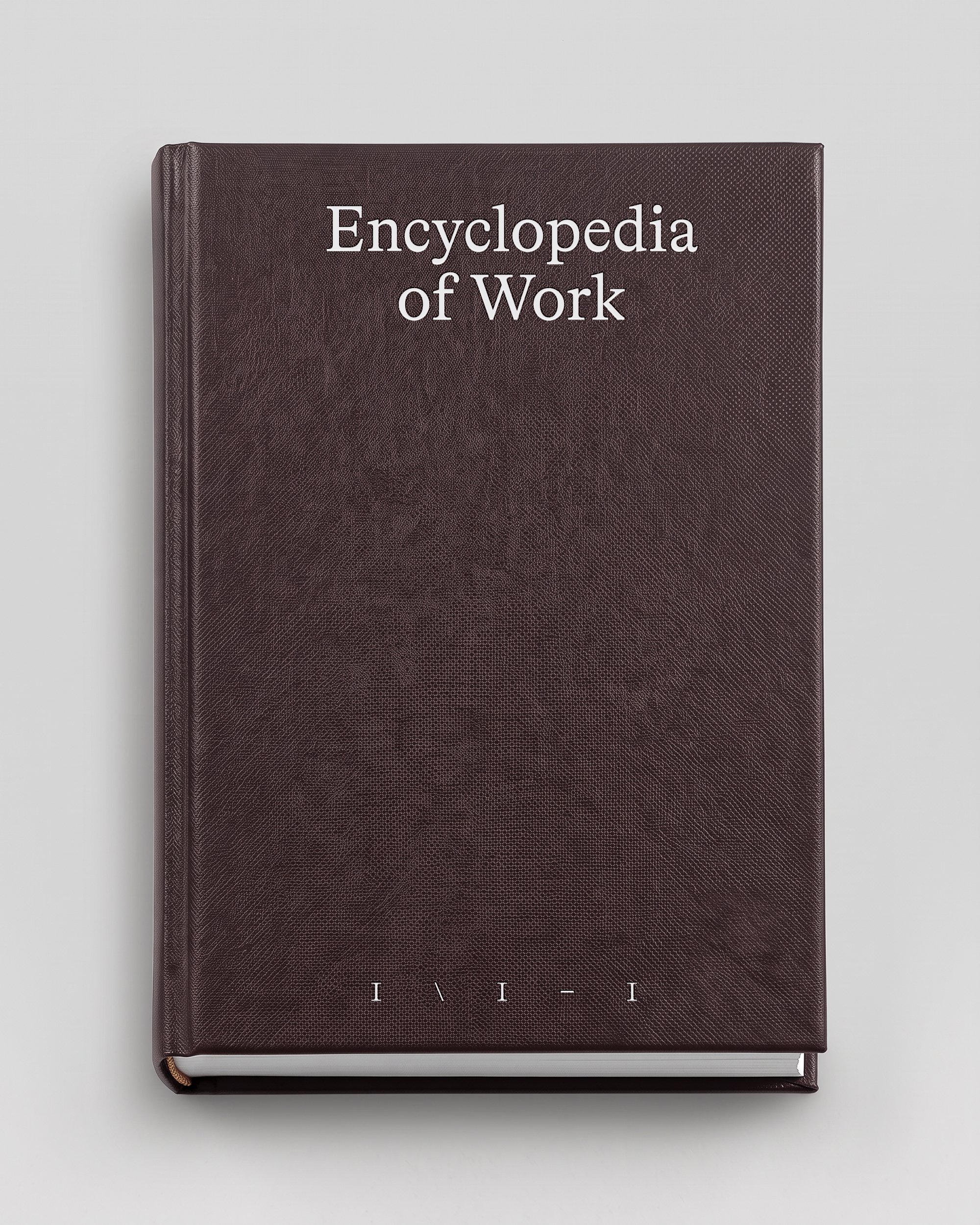
We landed on Bradford for this job because of its inherent authoritativeness. Its regular looks institutional like an encyclopedia, but its quirky glyphs and italics give it the crafty appeal that signals independence.
Having the typeface and the “logo” settled unlocked the rest of the brand and gave us time to focus on making it a dynamic, fluid identity that can work with several different visuals and colors, opinionated enough to be recognizable but not too much to overshadow the diverse creative work happening inside NeueHaus.
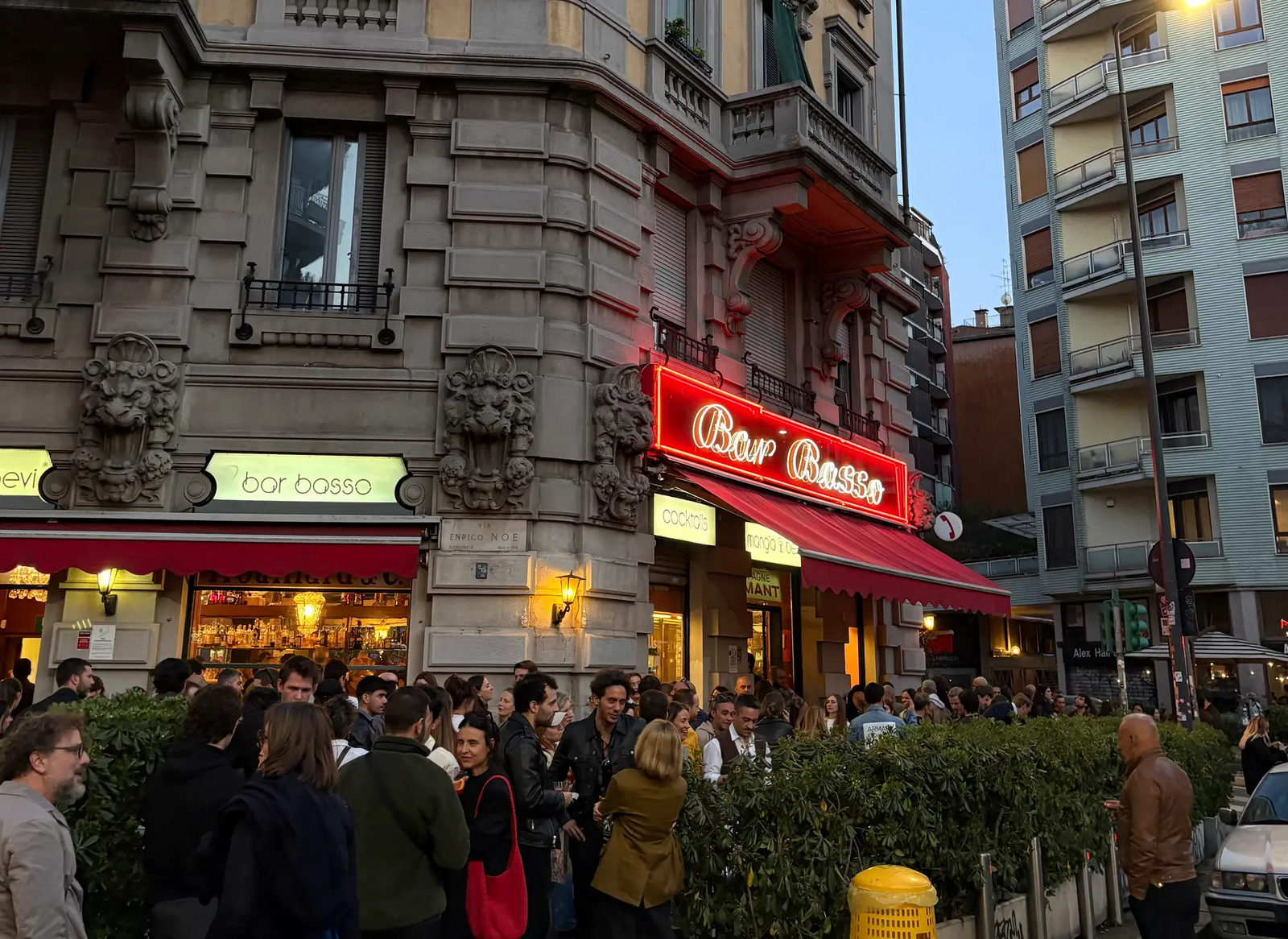
In conversation with Maurizio Stocchetto, owner of Bar Basso in Milan
-
Speaking with
6:AM
-
Creative Showcase
with Renee Rodan
The next version of NeueHaus: new membership offer and new design
-
The unperformative dinner
NYC – 09.21
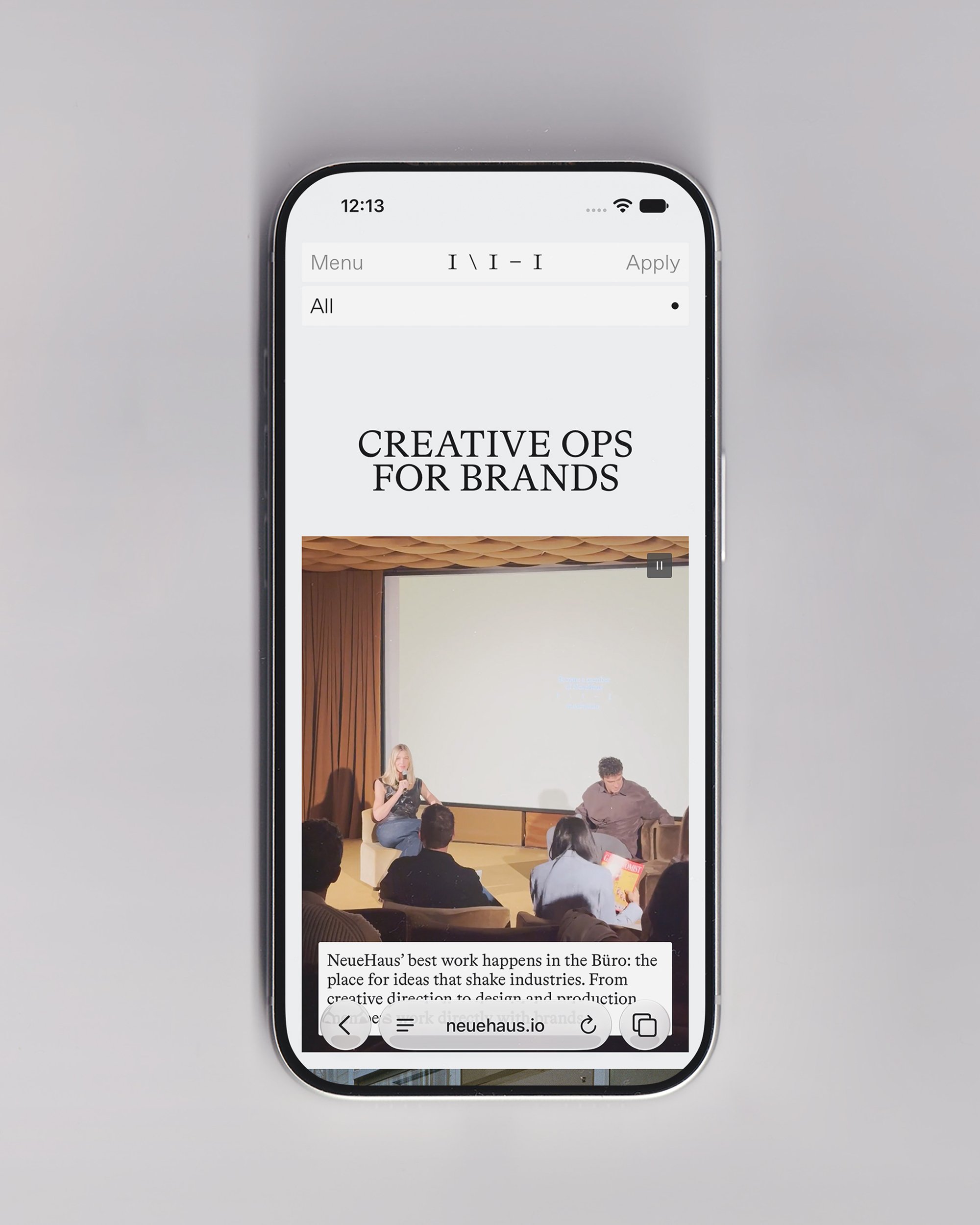
Complementary to this was creating a UI system that uses box layouts that resize depending on how much text they hold, and having a secondary typeface for more accessible UI elements such as buttons, inputs, member profile snippets, tags…
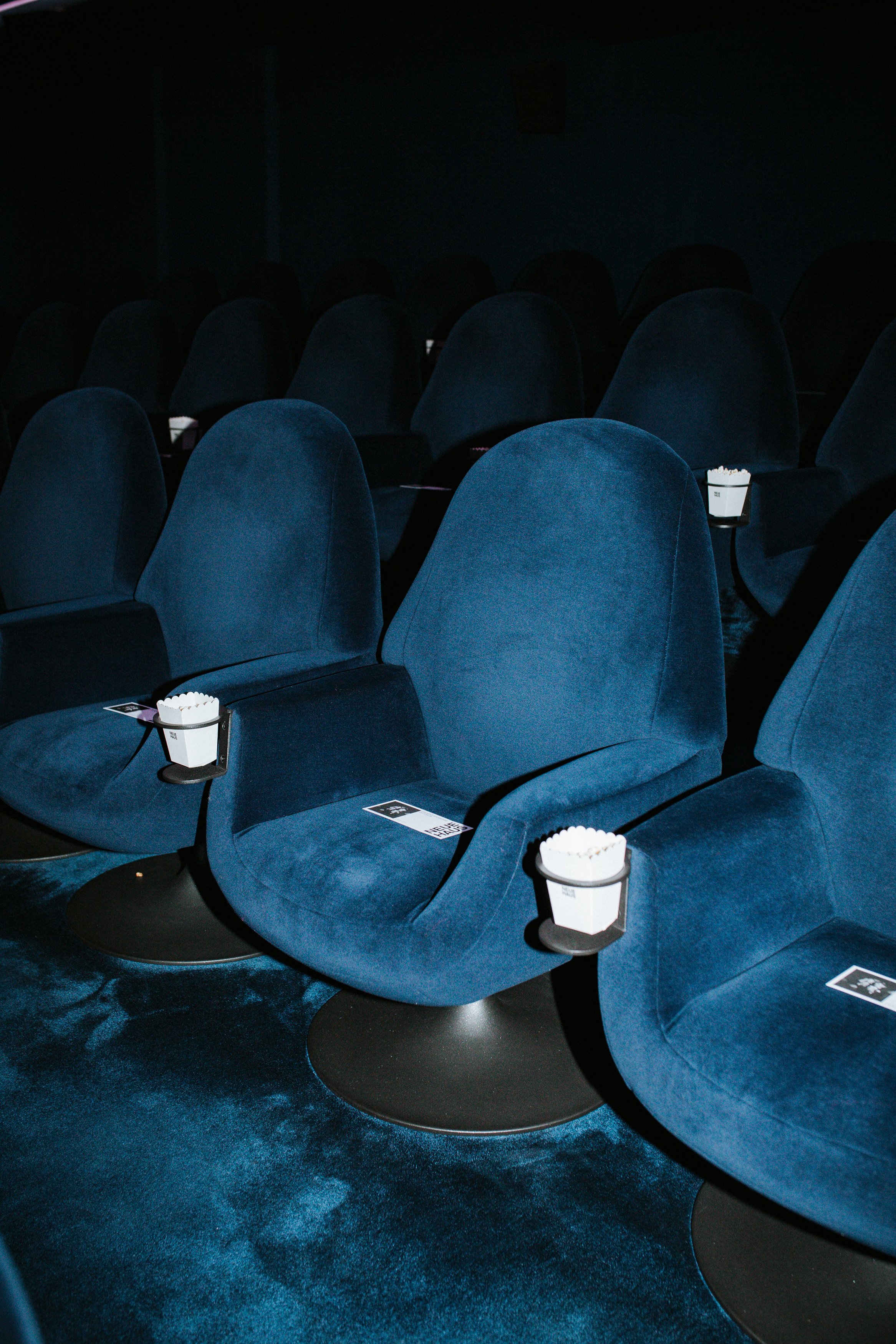
With such a broad range of disciplines and work styles, editorial and digital aesthetics to reconcile without being too imposing, motion helped us tremendously in giving everything a specific personality. Organic, gentle spring-based transitions, morphing boxes and subtle fades are what tie the website and app to our editorials and social content, and make it feel consistent.
Typeface, colors and motion principles working together with NeueHaus’ event photography and vintage office creative unlocked a rich brand system that extends far beyond our website, into our app, social content, newsletter, event creative, merchandise and memorabilia concepts. More importantly, it allows the heterogenous work and imagination of our members to shine.
Your curated rolodex
Lena
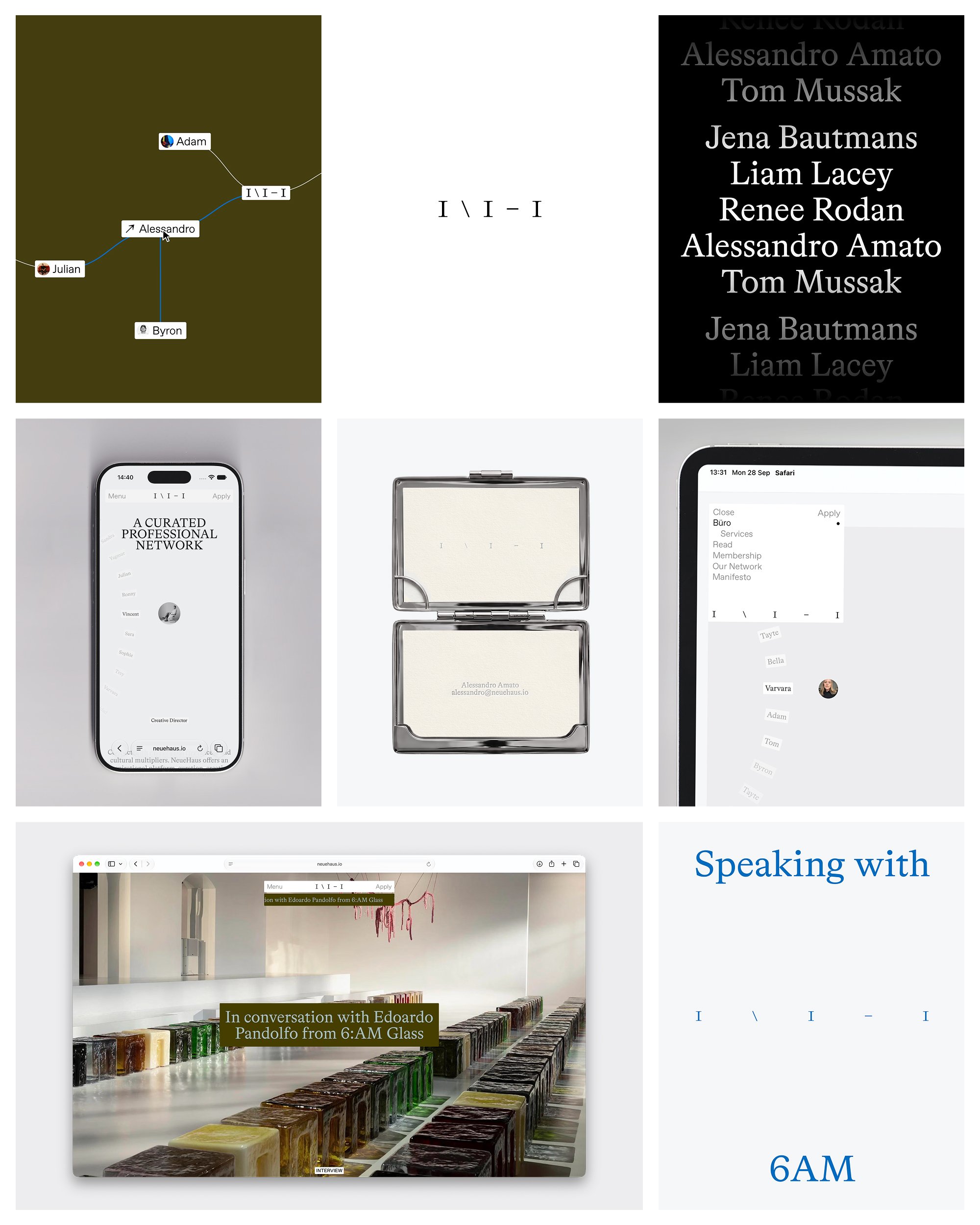
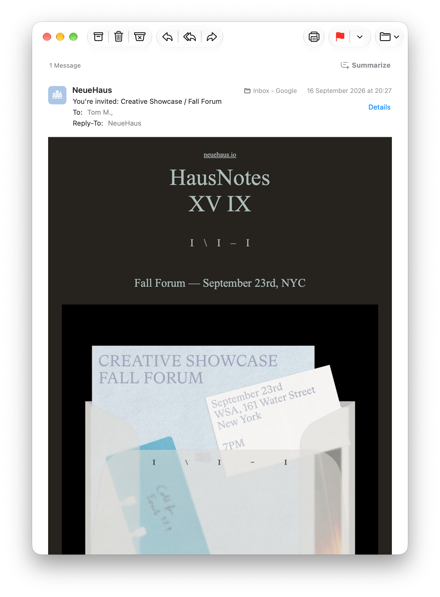
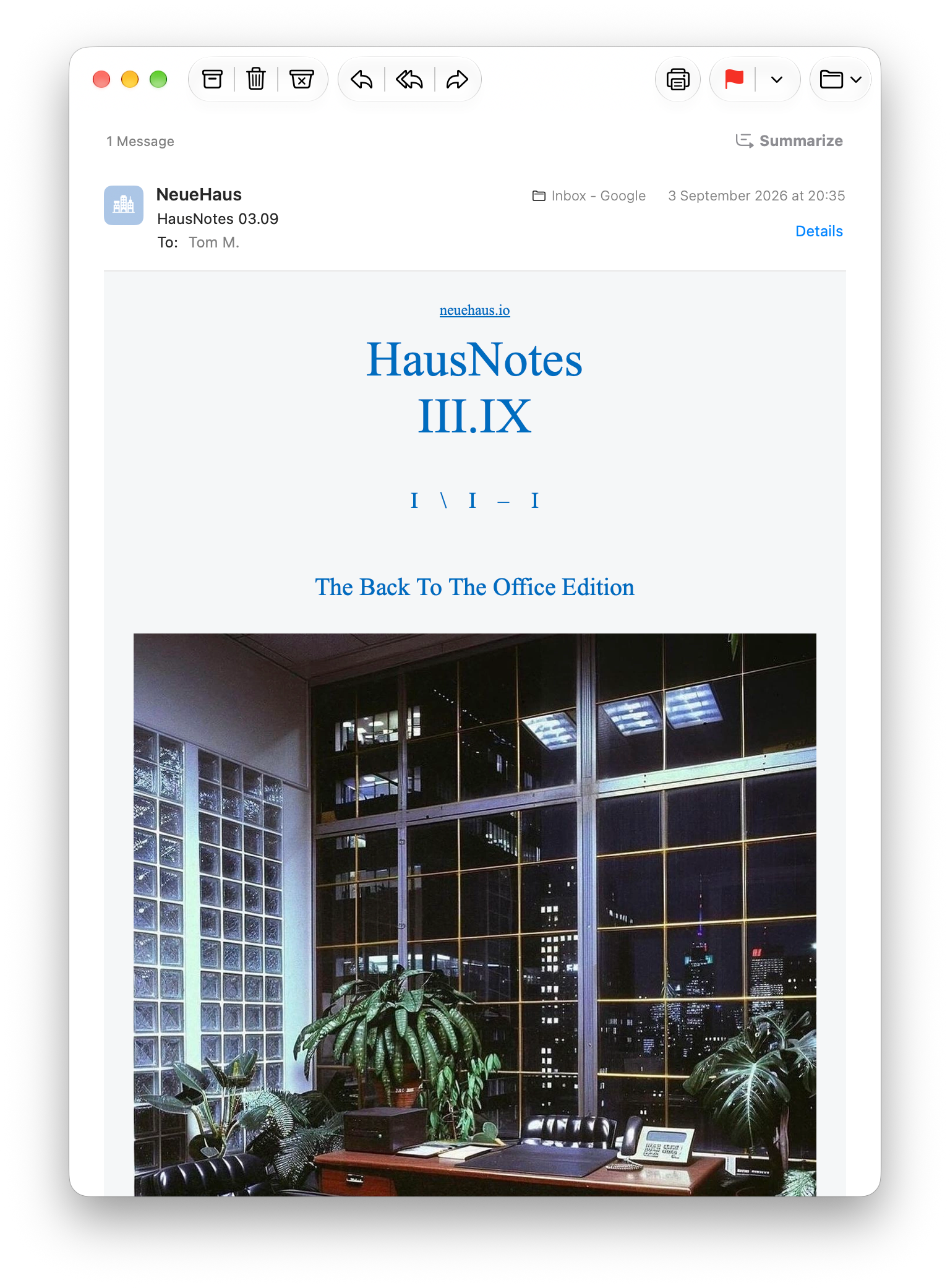
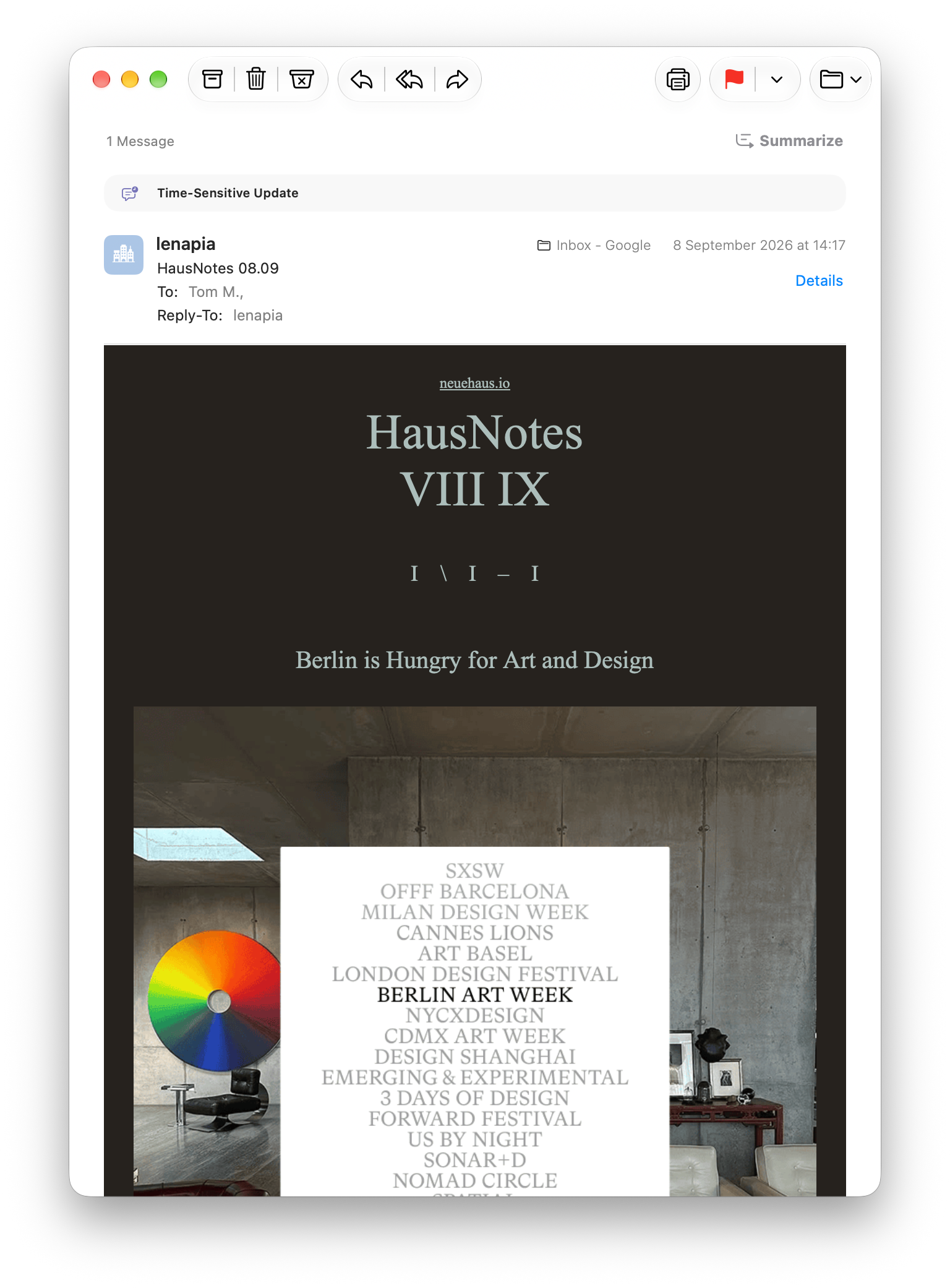
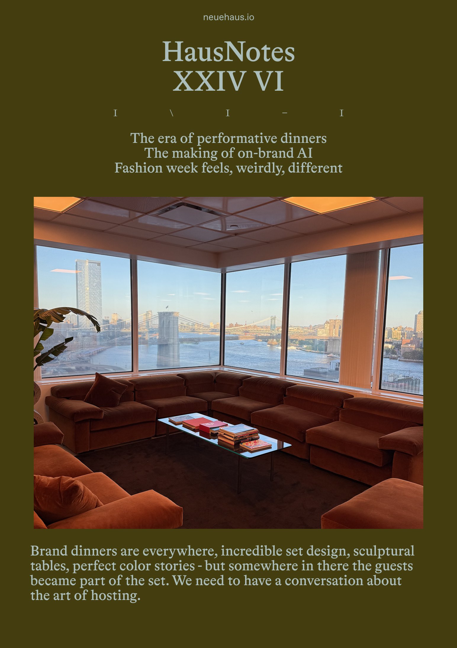
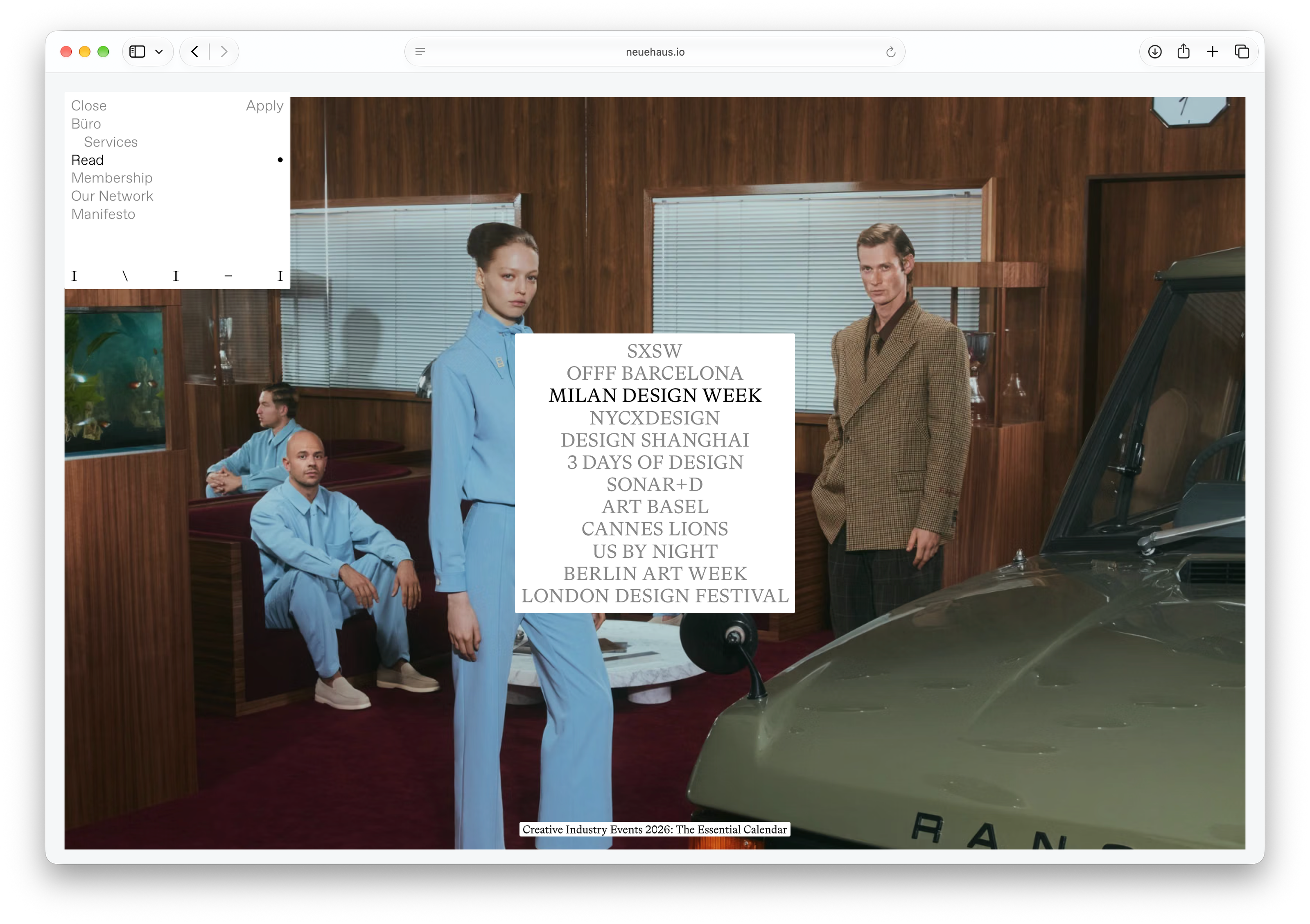
A fluid brand system for a contemporary guild of creative professionals. We believe this new chapter of NeueHaus will encourage our members and creatives at large to focus on what deserves our attention, to create meaningfully, and to curate.
Credits:
- Creative Direction, Strategy, Content:
Lena Pia
- Creative Direction, Design & Development:
Alessandro
- Art Direction, Brand & Design:
Tom Mussak